Sheldon Website Redesign

As a member of the Sheldon Student Advisory Board, I frequently visit Sheldon’s website to look up art, artists, and exhibitions. I was bothered by a couple of issues on their website. First, there was a lot of inefficiently organized information. Second, they must follow the design System of the University of Nebraska Lincoln, which limits their palette and ability to brand themselves separately. I attempted to leverage my experience and connections to design a website that would be more individual and more well-organized.

Due to the density of information on the current Sheldon website, it was best to design for desktop to preserve the information necessary for users. I also wanted to add a mapping feature to the current exhibitions in the Sheldon. I focussed on the experience of students as they are the current focus of the museum. I worked to improve efficiency for students, aesthetics, and attempted to add on a map feature.
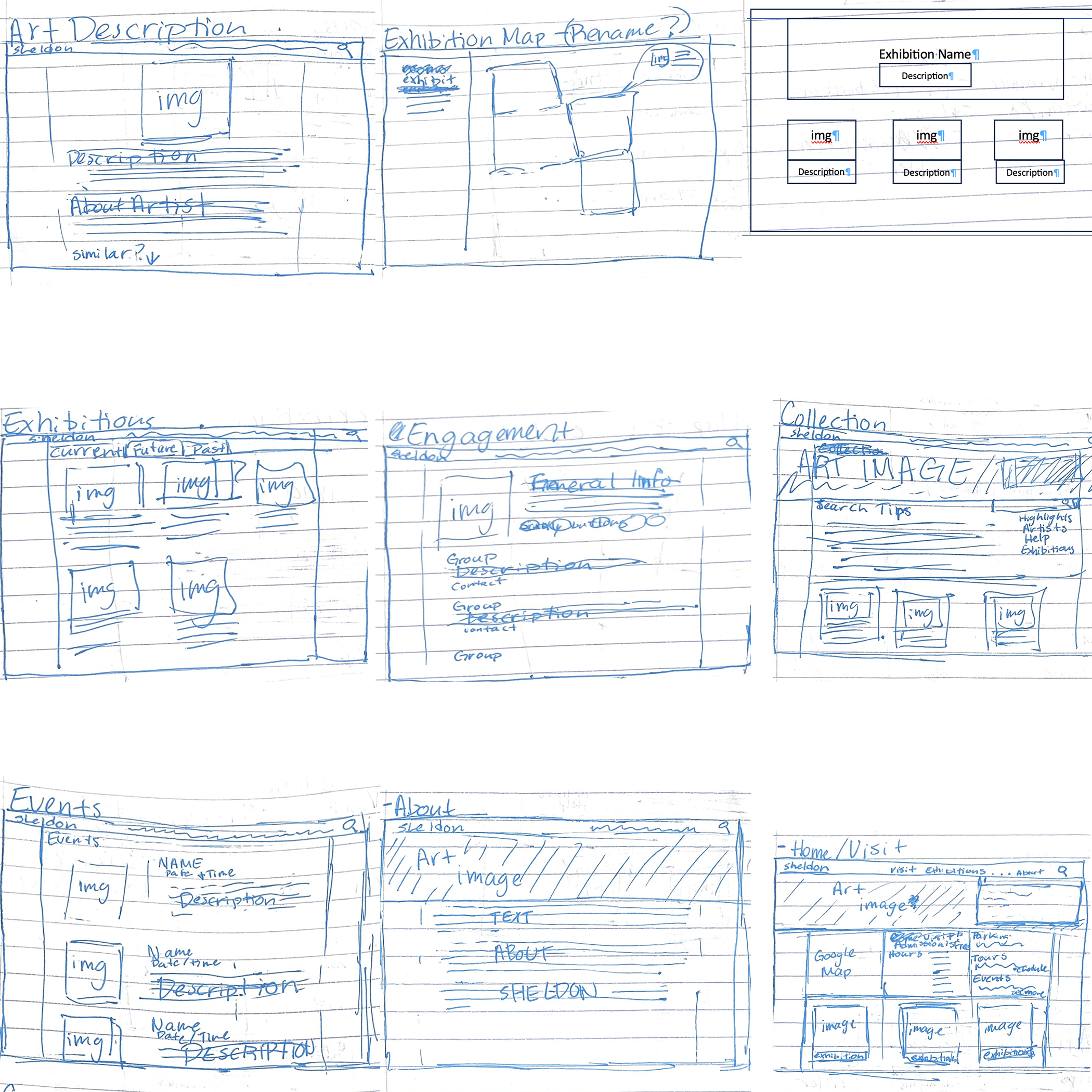
I began the process by sketching out the general frames I thought would be necessary in the website. I tried to start with reorganizing the information in the website. Then I applied that to a layout that used the rule of thirds to organize frames of information. I also considered gestalt principles of hierarchy to make sure related information would be grouped together visually.

I started my design system by watching Build it in Figma: Create a Design System I then thought about what colors made sense for the Sheldon. I thought about intelligence and trustworthiness are aspects of the color blue. I thought about purple being a color associated with wealth and I thought that pushing an indigo color would fit. I also incorporated a mint green to be something in contrast with the indigo. I then tested out shading the indigo to get a nice type color and lightening that type color to get a background.

After I had a design system and sketches I worked on creating a mockup in Figma I decided to remove a couple of pages and made it as close to what I saw as the final product as possible.

I converted my mockup into a prototype by adding page links. I then got peer feedback from a classmate and had them go through my user test and give whatever input they could. Some of the feedback was on how I presented my user test, some were bugs in my prototype. After fixing what I could I felt prepared for user tests.

I did 3 user tests: one with a software engineering student, one with a fashion merchandising student, and the last with an adult outside of UNL. I asked them to complete 2 tasks: 'find a good day to visit the Sheldon where you could bring children and have an activity for them to do', and 'find a painting you are interested in and find its physical location in the museum.'

Changes I have made as a result of my testing include: making margins more consistent, darkening the link color, making the background grey lighter, adding visuals to the events page, and improving the map pages. I realized that even when you are testing limited capacity it is in your best interest add as much functionality as possible. I learned that a lot of small details can be distracting to users and that making sure those details are consistent is important.

As I have time, I am continuing to improve the final prototype, but I think that my growth can easily be shown in this project. It's been really interesting to learn hands on some of the processes that go into designing a web page. I also feel like I have learned a lot about Figma which I will definitely be using in the future.

Contact

let's work together sometime


Find me on ...