
Journals
These are posts about activities I've done to exercise what I'm learning. In addition there are some entries for things I've read that have guided my practice.

These are posts about activities I've done to exercise what I'm learning. In addition there are some entries for things I've read that have guided my practice.
I wanted to map stages of interview prep along with what to focus on in each stage. So I have research the company, prepare a tailored resume and portfolio, and Interview which maps to the types of questions, and activities covered in most interviews. General questions has a note emphasizing that this preparation should focus on avoiding rambling. Situational questions has a note that you should keep answers concise. So while telling your stories try to stick to the important details. Design challenge says to ask clarifying questions. So get as many details about the problem as possible. Finally questions should cover anything you are curious about and you shouldn't hold back any questions that come to you.
A group of my peers got the opportunity to research and present certain groups of people's unique design requirements. I presented on Rural communities, but others advocated for Gen-Z, color blindness etc. Afterward we had to advocate for each group's needs and argue down to a list of about 12 features that would be necessary in a vote by mail website. For rural communities I focused on meeting their needs for reliability and clarity. I originally recommended low wi-fi accessibility as well as a comprehensive set of instructions for the entire interface. Luckily, many other teams had similar needs so by grouping up with many other groups Those made it into the final set of features. Some of my goals needed to be reworded to fit in some of my allies needs. My low wi-fi requirement was combined with quick loading times for Gen-Z. in addition to this the comprehensive set of instructions was combined and cosigned with several other teams to result in the inclusion of a step-by-step guided process with visual aids for multi step tasks. I also was convinced to cosign having a Flesch Kincaid reading ease score greater than or equal to ninety percent. Honestly, this activity was a little chaotic, but it was really interesting to hear what each group's needs are and find common ground between unsuspected allies. I think that It's a good reminder that disabilities are a spectrum and at any point in your life you could need more or less help. Today's people will be different than tomorrow's and we need to be prepared for their needs as time goes by.
The example of the Lego police officer on the motorcycle was very helpful. It was easy to understand the four types of constraints(physical, cultural, semantic and logical). I am reminded of many times where I have attempted to disassemble items to clean them and put them back together relying on the previous construction and what I think fits. Having to disassemble a vacuum to clean the filter or clear the wheels of my hair has always been made easier by the design of the vacuum. The ideas he as for mapping out light switches were interesting to me. They may be useful for a physical representation of lights, but they may be easier to implement in a digital format. Physical representation is good, but I wonder about the pedestal and the jutting out panel being obstacles or something I might run into. I liked the idea of an indent, that helps keep switches of the way physically and can still facilitate the access I think he intended. The passage on the faucet felt very familiar to me. I have struggled with my aunt's faucet every time I visit. There is a handle to control water temperature, but the faucet itself is touch operated. When you want to turn on the flow of water you need to tap the spout. As a software engineer I am more familiar with constraints forcing behavior. I still fall for it when people forget to add them in though. I ordered the smallest pair of pants from a company because they do not require users to pick the size they want before adding it to their cart they just have a default setting for the smallest size. It would have been nice to at least be prompted before adding it to the cart. As far as his experience with crossing roads being more difficult with the rise of silent cars, I agree. I often am distracted when walking around town and rely on my hearing to know if a bike or car is coming.
I have often thought about inclusive design when it comes to colors. I appreciate his recommendation of CSS as a coder I have pretty much always used it, but now I have another reason to continue using it. I appreciate a lot of the tips for creating pages that are resizable and having skip to content buttons. I also will be implementing more keyboard functions from now on. Krug often writes things in a humorous manner. So the final chapter on how to speak with your boss about being asked to do bad design is quite fun. I probably will not rely on his emails, but it was a nice gesture.
I like that Krug starts by making a case for User testing in chapter 8. I have had many arguments about what form of Interface would be best, without having the chance to test. Testing should be a priority where there are questions, and arguing about details is a waste of time when users are available. It's good to see the theme of fail fast and fail early in chapter 9. I also appreciator the idea of doing it frequently and early important. To that end he has some advice for interviewing that is helpful. Like just being more efficient by using anyone a truly random sample.
i love how clean all of these portfolios look. This really shows how many trends there are in design. There are lots of similar color choices and similar layouts that pop up throughout the Portfolios. The most interesting ones to me were Adrian Weber, Melysia C, Alyssa Ignacio, and Dae Hyun Baek. I feel they really broke some of the monotony of these pages and had a fun way of breaking rules that made their designs interesting.
I enjoy how much Figma really tries to give uses as much information and help as possible to help them use their tools. The version history they have could be really useful to just have the changes laid out chronologically. I tend to lose sight of where I started in the process and this could be good for fixing that habit. Because I have used Figma and Adobe XD in the past I have a good foundations for what can be done in prototyping. I think my next steps after watching this will be learning the keyboard shortcuts for Figma. Hopefully this will make using this tool more efficient.
Starting with encouragement to approach each issue with beginner's eyes is good advice. Positivity through your work can be a way of keeping yourself from burning out and finding enjoyment in the process. Healthy curiosity is important n how we approach a new project. Working with constraints can be helpful some of my favorite classes have been ones where the only requirements were restrictions. In color and composition we made pieces using limited color palettes. I think a cyclical reminder of core values and message is as important as Reynolds says. If we continue to return to the point we can also help our users get the point.
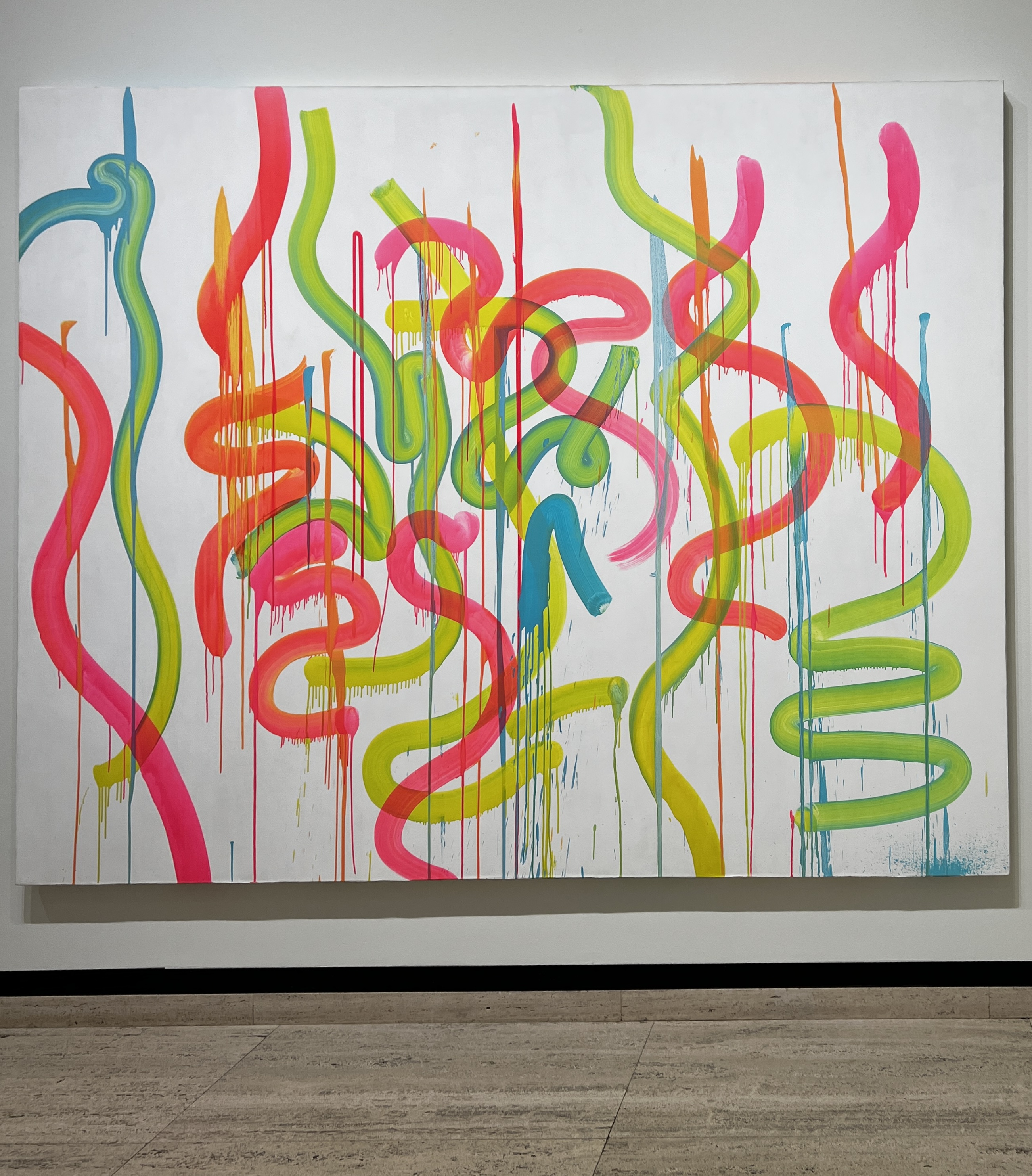
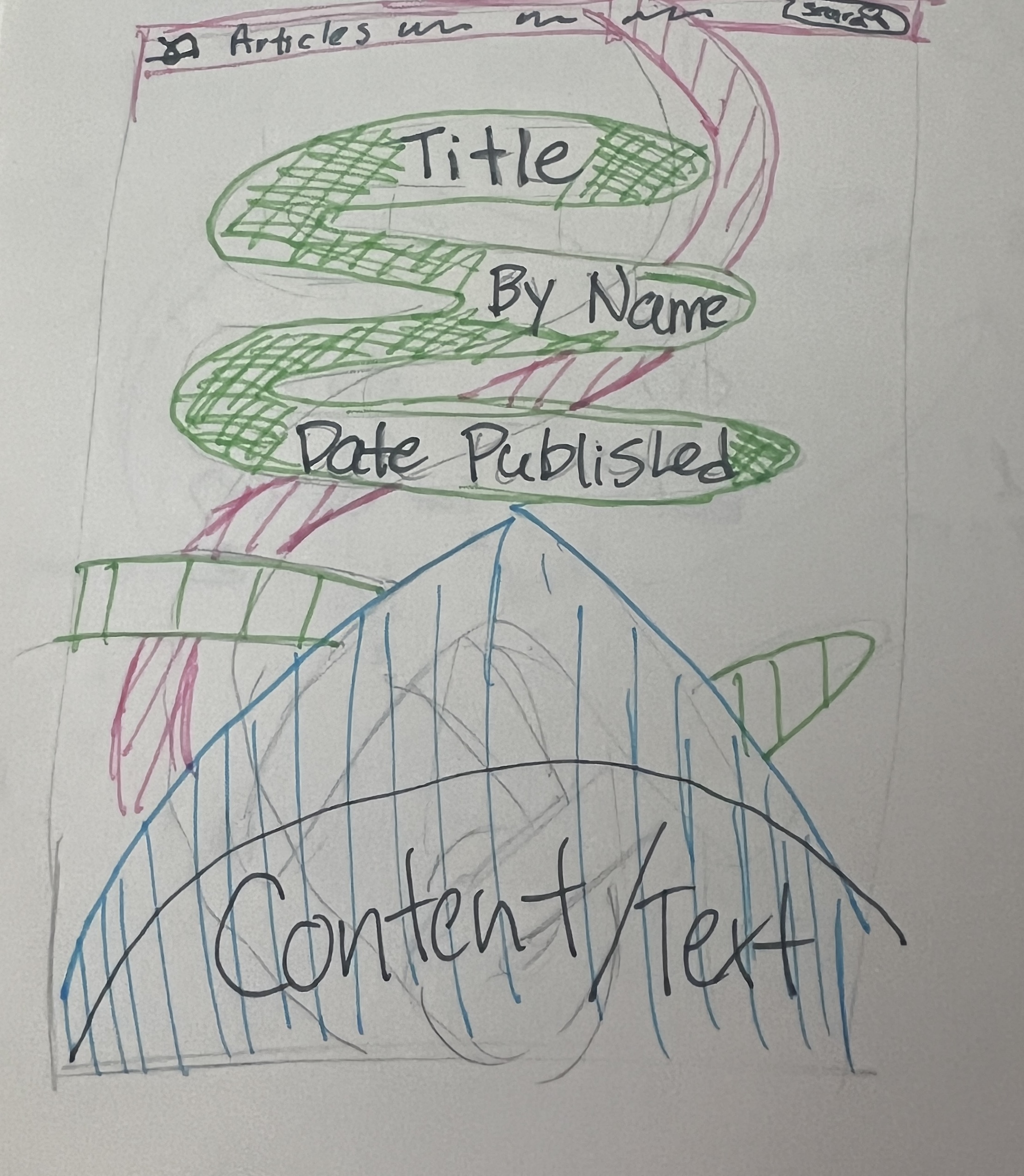
A lot of the time I feel reticent to give feedback to my peers. Hearing the benefits listed out in favor of feedback is encouraging. I will work to give as helpful feedback as possible in the future. To that end, getting tips for how to talk about work with a designer is also helpful. I'm so glad the compliment sandwich is being thrown out. In previous projects I have experienced problems with giving normal feedback to my peers and they would request a compliment sandwich. Inevitably resulting in the remainder of their task being thrown to rest of the team while they expected gratitude for delivering the wrong results. It was also reassuring to hear that not being able to take that feedback was not the fault of my delivery, but simply an unused skill of taking criticism. I will definitely be using the tools of fostering feedback with myself.
I enjoyed having a reminder that I should not try to put everything in the home page. I'm a little worried about advertising on websites, but maybe that's just me. I was not even taking them into account in web design, because they're the worst. Most of what I look at online are companies not hurting for money enough to add advertisements to their pages. Those companies usually only need to advertise their own products so they might use an entire page for promotion. I hope I never need to consider advertising other things on a website I design.
Build it in Figma: Create a Design System As I'm working through muy projects it's nice to see someone else solving similar problems at the same time as me. I think some of the thought processes and tool explanations are super helpful. I'll definitely be rewatching this in the coming weeks. I like how approachable he makes working on this feel and I'm excited to get in the weeds.
How
a small team built figma.com’s design system
It's nice to see a company focussed on design come down from a level that feels unreachable.
I enjoyed hearing they too had had a past of inconsistency and had worked to fix it.
Space, grids, and layouts
This was a really nice guide for how to design spacing on a page.
It was nice to see a definition of adaptive layout, as I have been wondering whether that was
common design practice.
I've really only observed responsive and strict layouts so hearing that it is an option is nice.
Typography
A Clear guide on what to consider when selecting fonts.
Guide to
content strategy
I have honestly not thought much about the content of this article before.
But I appreciate the clarification on Common vocabulary and casing.
The other areas mentioned are definitely more useful for industry, but I will keep this article
in mind for future reference.
The original Colors of Google's calculator are greys, blue, black and white.
Blue is often seen as trustworthy this shade is bright and really draws the eye.
I could tell they wanted to emphasize their numbers and that equal sign more the other buttons.
I wanted to start by adding more emphasis to the other sign buttons and switching to something
more energized so I changed to a bright orange.
This lost some of that important emphasis on the = in the calculator. It also might not have
been the best shade it was a little aggressive.
Next I had to try a more muted color so I chose a sage and replaced the blue with that.
I thought it could be more natural than the Blue, but I understand why google needs to follow
their own guides for coloring.
Also in addition to the stark white and black it was not a great match.
I considered making it a tan or brown arrangement, but found that that might be too far from the
ordinary and ind of jarring.
Then I tested a brighter green, but found that it would match better with a black background.
I feel this green has a similar effect to the original blue and keeps the numbers interesting.
Making the numbers a lighter green added more emphasis without competing with the = button.
Finally I wanted to see if the dark theme would work with that original blue used by google.
I ended up not loving just a tinted blue it was too distracting unlike the light green.
A grey blue worked, but I'm not as happy with it as just the dark theme Google already has, I
feel that may be why they had chosen such a minimal use of color.
Dark theme really limits what colors are still usable after switching backgrounds.
I think my personal favorite color is the dark themed green. Green is my favorite color and I
also prefer dark mode for most things.
However I believe that Google's original is more robust and works better both light and dark
themes.
The way the Steve krug takes time to analogize physical navigation and virtual navigation is very helpful. Although we may not think about how to get places all the time, we need to remember this while designing our websites. He has lots of good tips about how obvious things should be and how important the mindset of searching for something is. You are here is an especially helpful section, because I often feel like excluding this part in my design. In the future I will make sure to add this back into my designs.
It's nice to have a written reference for the feelings colors can invoke. I also enjoyed how they spoke of personal color. I tend to associate members of my family with their favorite color. For some, like my grandmother's red, it made a lot of sense. Others seemed harder to pin down. But maybe color preference can be like a horoscope. If you like blue you are more calm, but I think it can be hard to have the same perspective on color and have it mean the same to everyone.
Because I have Previously taken Color and Composition. Much of this chapter was simply a good review on the verbiage we use when describing color. I did enjoy the opening where they described the experience of color and from the scientific light reflection to the synesthetic musings of Wassily Kadinsky. Sometimes I forget how different everyone's experience of even the presence of color can be different. But I truly enjoyed the passage on discord and dissonance. It's not often that books encourage you to break rules, or consider the chance to break rules. The aesthetic rules of minimalism can be quite restrictive. I want to take time to redesign my own spaces and find ways to break rules in how I arrange things. It truly plays into the conscious break of rules that we have discussed in our courses.
When designing presentations it is important to take into consideration several points in the
design
Signal-to-noise ratio - the ratio of relevant information, to irrelevant information.
That noise can be both useful and not useful.
- If you have text sometimes adding a picture or something unnecessary can keep people
engaged.
- If you have a chart you might not want to make it too noisy or it will become hard to
read.
The picture superiority effect - Sometimes pictures can be more memorable than words
In tandem with the previous point, pictures can make your text more memorable and have more
impact than the written word. Consider if what you are communicating would benefit from a visual
component instead of a text recap.
Empty Space
Empty space is important because if absolutely everything is cluttered it can be overwhelming.
It may be beneficial to stick with only what you need and leave space so people can focus on
your content.
Emphasis and grouping: Contrast, Repetition, Alignment and Proximity
Contrast can be used to both add Grouping and emphasis. Contrasting one element with a slide =
emphasis. Contrasting several elements to group together.
Repetition can add harmony to objects and group them together. Maybe a bulleted list isn't
enough. Starting each bullet with the same word can leave a greater importance to what groups
those elements.
Alignment is another visual cue for what elements should be grouped and emphasized.
Proximity falls in a little with alignment. If things are close together they can be grouped; if
they are far apart they may be seen as separate entities.
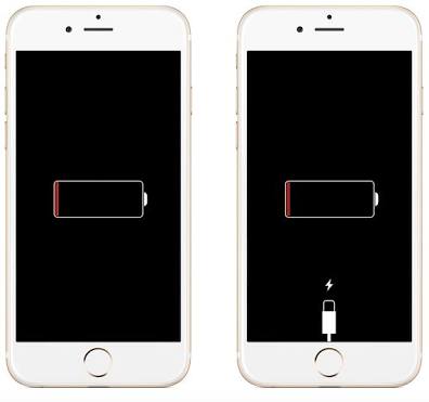
The first chapter really focuses on the interfaces we interact with, but the second focuses on the how and why of our interactions. There are 3 levels of consciousness we use Visceral (Emotional, immediate, aesthetic reactions), Behavioral (Learned skills), and Reflective (Conscious view of the world and our plans). They work hand in hand with our seven stages of Action and help us understand why and how we do things. This chapter really hits home the importance of feedback in an interaction which lets us know we are doing what we hoped when we interact with something. If I plug in my phone I expect it to charge, but if I don't see the little lighting bolt I will wonder why I was unsuccessful. This allows me to complete my task properly by problem-solving around why what I want isn't happening. All of the steps and phases are iterative and can be repeated or changed at any time.
Chapter 1 could probably be brought down to the concept of KISS. (Keep it simple stupid)
When designing we need to focus on the use of objects and how people interact with them. We
should make it as easily understandable by a user as possible even without in-depth
instructions. Some of the concepts we can use to fill in the gaps of design for a person are
affordances and signifiers. We should be building things by limiting or obviating their
affordances physically, as well as visually. This can make a user's life easier and help them
use the object as intended. We are trying to make things easy to use and that should be top of
mind as we design them.
I think the most memorable example of this in the book is the door examples he gives, but I
think another example can be filing. If I were to nest every file in a million folders things
would get complicated fast, but if I name them specifically and use broader folders I can get to
things faster and understand better what I am looking at.
let's work together sometime